Rebelskin's mission is to offer a reliable and natural sun screen for surfers and other water enthusiasts, that protects both the skin and the environment. This project focused on crafting a captivating brand design as part of my graphic design class in the Master's program.
Design Solution
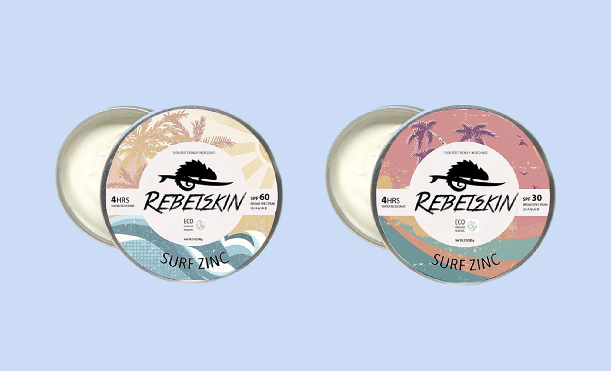
The visual design process for Rebelskin revolved around creating a playful retro design that captures the adventurous surfer lifestyle and a rugged brand personality.
The Chameleon Logo reflects the idea that the skin remains unaffected by the sun's harsh rays
A Pastel color scheme highlights the brand's connection to nature
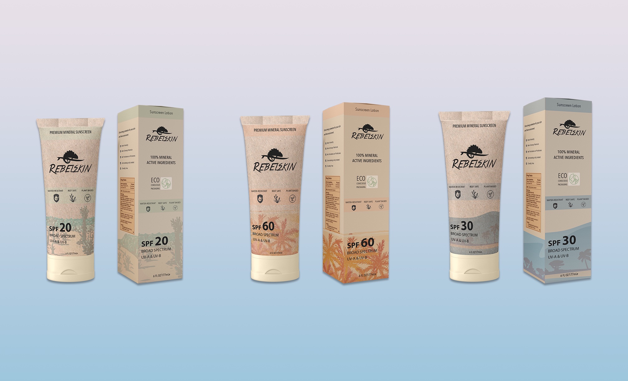
Sunscreen Lotion Line
 The design highlights sustainable paper packaging, while each SPF factor boasts a distinct visual and color retro design. The packaging prominently showcases the brand's commitment to three core elements:
plant-based reef safe and water resistant. 
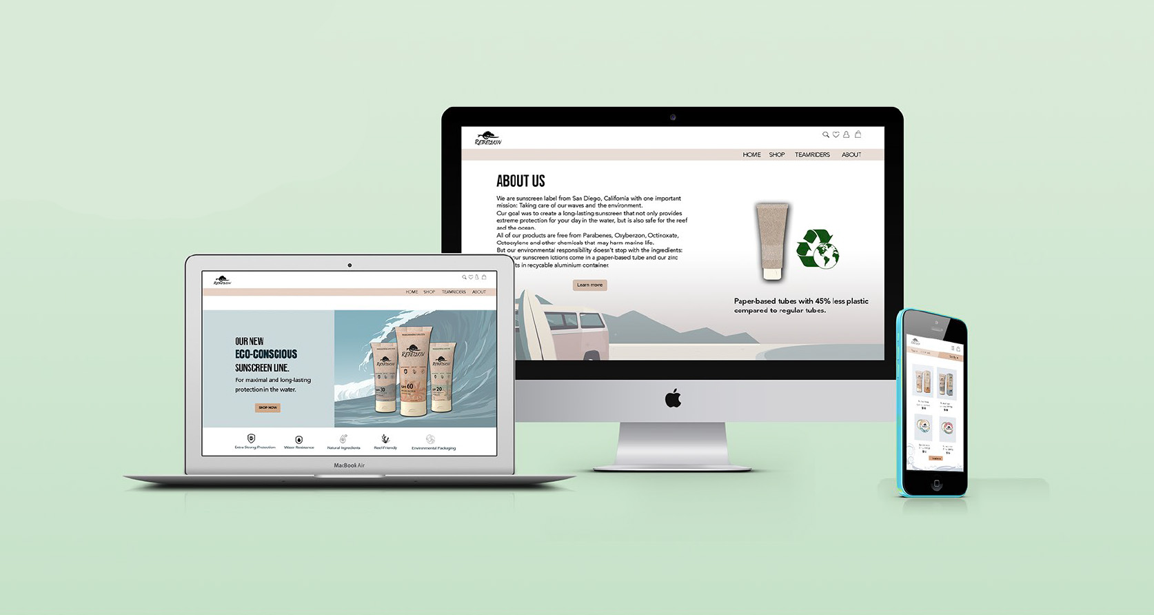
Responsive Webdesign
Integrates with the packaging
User-friendly shop interface to
boost conversions and enhance customer experience

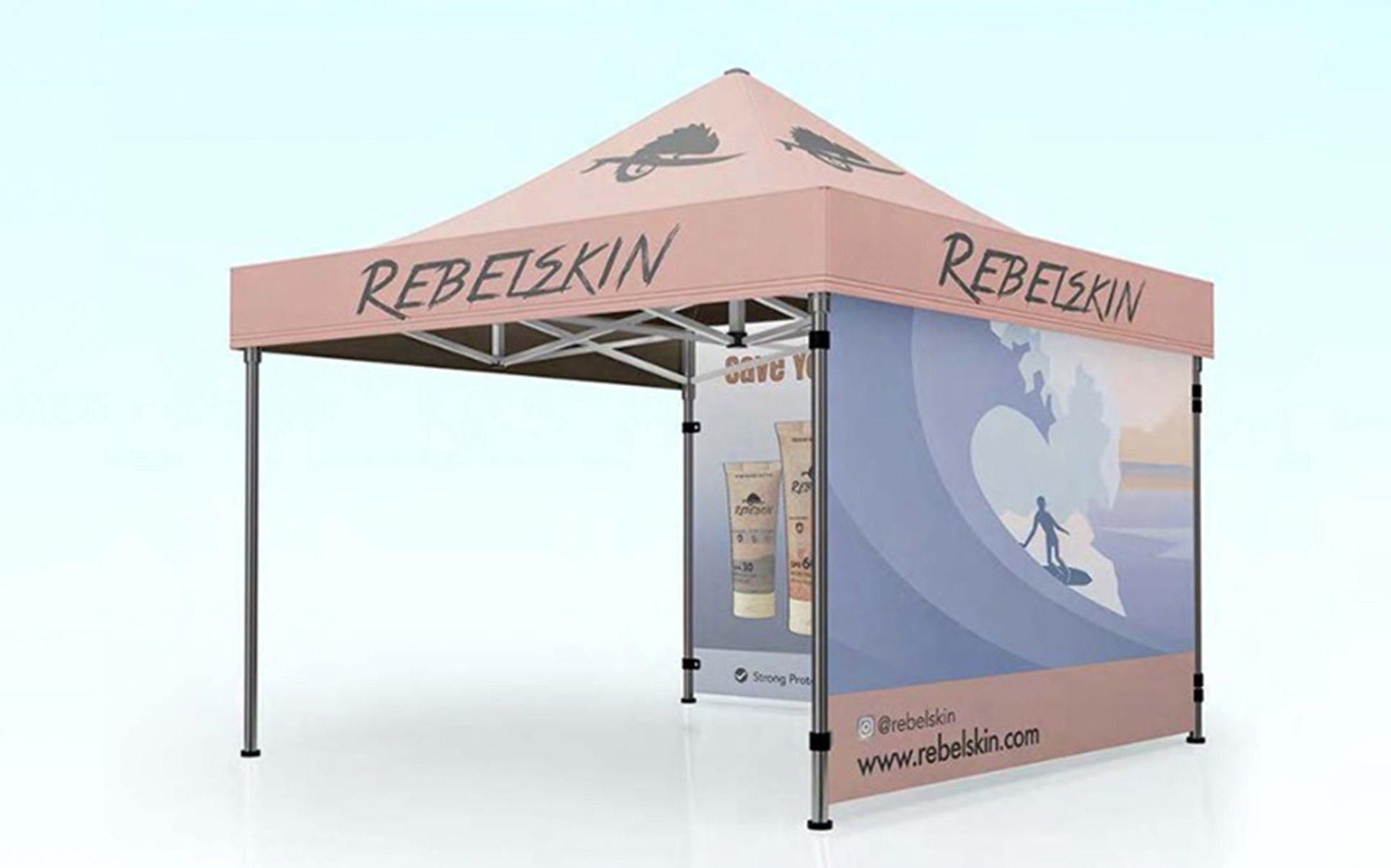
Promotional Material
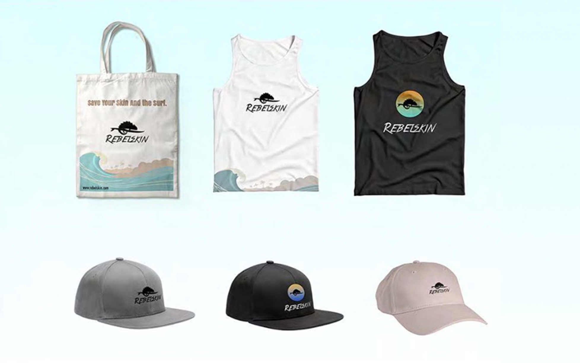
These captivating pieces prominently showcase the brand's logo in various iterations, seamlessly reflecting the retro/pastel color scheme and reinforcing the overall branding.


⬅ Back to Projects
